Comparing IBM Plex and Fira Sans
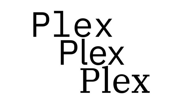
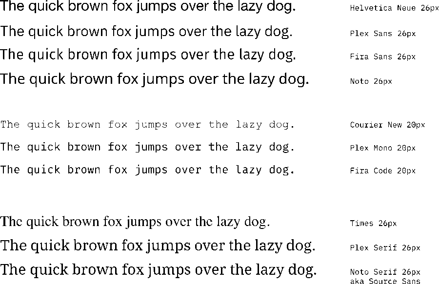
Here's a quick comparison between, Plex, Helvetica, Fira and a couple of other stand-ins.
I won't dwell on it, but Helvetica and Helvetica Neue are not ideal fonts for the web for technical, brand and usability purposes, particularly when you're showing a lot of scientific data tables, as we do at EMBL-EBI.
Small note: Within EMBL-EBI we've used Helvetica Neue as our "corporate" font both in print and online for many years, now we're considering a change. The below blog post is shaped by that discussion, but the thoughts here are my own.
After a lengthy discussion and consultation we're currently analysing Fira Sans as our likely next font for both corporate and data uses. For those that don't recall, Fira is an Erik Spiekermann typeface that was developed for Mozilla's now defunct Firefox OS.
We're working through the best way to utilise Fira Sans (and the great Fira Code). A major concern are fonts when it comes to data tables.
On with it, already#
But what I want to chat about is what IBM has been up to: unveiling their new Plex font family made by Bold Monday.
The typeface is impressive stuff that captures my interest:
- IBM is looking to solve many of the same issues that we are at EMBL: Helvetica is an imperfect and bland go-to choice.
- Plex has a nice bit of personality in its letter forms
- Plex is a full family with many weights (8) and a serif, sans and mono style (it's also due to land on Google Fonts)
- Plex has an open licence
- Plex has a wide international character support
- It has an active development community
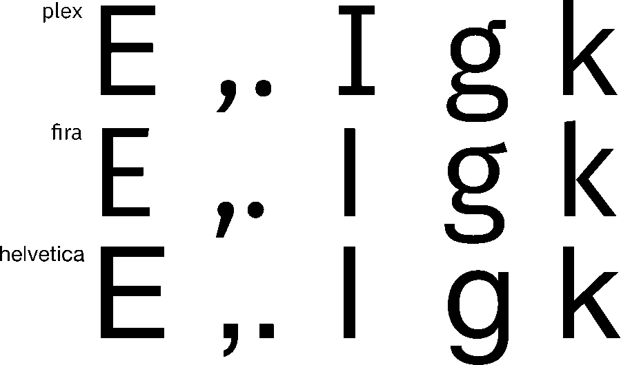
With the exception of the serif style (and perhaps the development community), Fira has many of the same advantages. I also noticed that Fira and Plex share quite a bit in style, so I wanted to take a quick look at some of the letterforms.
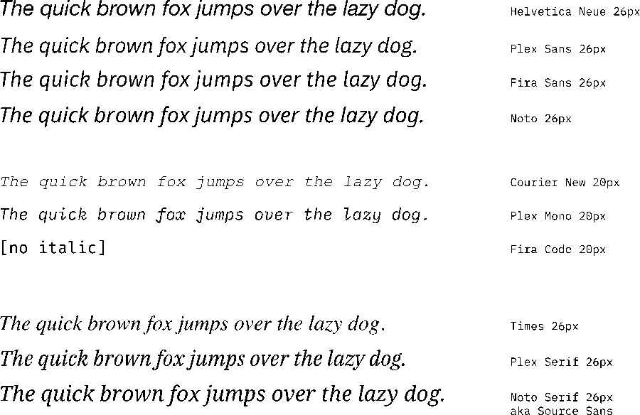
Here's a quick comparison between, Plex, Helvetica, Fira and a couple of other stand-ins — these are SVGs, if you want to download and compare glyphs without having to install fonts.

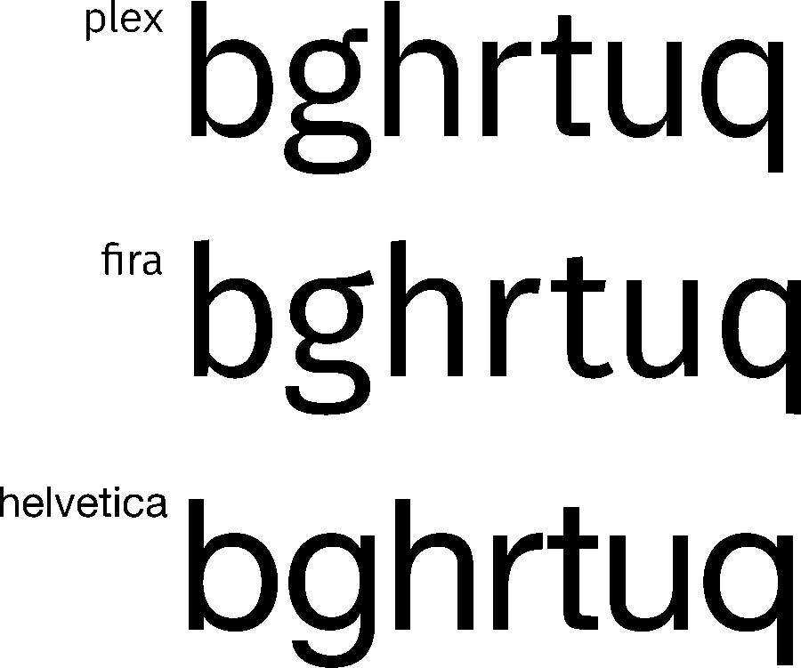
On the style side, there are two major differences:
- Plex has distinct narrowing on some of the lowercase letters that are reminiscent of "ink traps"
- Fira has a slightly whimsy feel with the top and lower cap on some letters (look at the ascenders of the b, h and h, and the q's descender).
That's all for now#
On the whole, Plex seems a bit more conservative, practical and airier than Fira.
I'm sure we'll hear much more about Plex in the coming months (I'll also be very interested in the nice tooling around their design system), but I did want to compare and contrast Plex and Fira specifically — or, at least a little bit of them.
If you want to have a play with Fira or Plex on your desktop, here are links (they're open licensed):
If you're also interested in using Plex in a data-heavy environment, I'd be curious to know how you get on with it: 🐦 @khawkins98